An onboarding flow can be beautifully animated and still fail at its one job: helping a new user feel why the app matters.
We studied 13 X posts and walkthroughs from app builders and growth writers, spanning fitness, focus, collecting, wellbeing, and other consumer subscription apps. Their preferred flows vary. Some use a long questionnaire before a paywall. One gets people into the product quickly and waits until a later visit to charge. Across those differences, a few principles keep appearing.
These posts are practitioner accounts, not controlled studies. Revenue and conversion figures below are the authors’ reports. Treat them as ideas to test in your own product, not promised benchmarks.
1. Start with the moment the app becomes useful
Jay Dwivedi calls this the activation moment: the first action that makes the product click. In a fitness app, it might be completing a workout. In a writing app, it might be starting a real document. The first-run flow should make that action easier and faster.
This changes the planning question. Instead of asking, “Which features should our onboarding explain?” ask, “What can a new user accomplish before we ask them to subscribe?” A feature tour shows potential. An action gives the user evidence.
2. Ask about the goal, then use the answer
Several examples start with a goal question: improve focus, sleep better, finish a paper, or reach a fitness outcome. That is a good first question because it lets the user name the result they came for. It also gives the product a way to make the next screen relevant.
The second part matters more than the question itself. If every answer leads to the same screens, the “personalization” is theater. A goal should change the plan, example, recommendation, or first action. Ask only for information the product can put to work soon.
3. Show a result before asking for payment
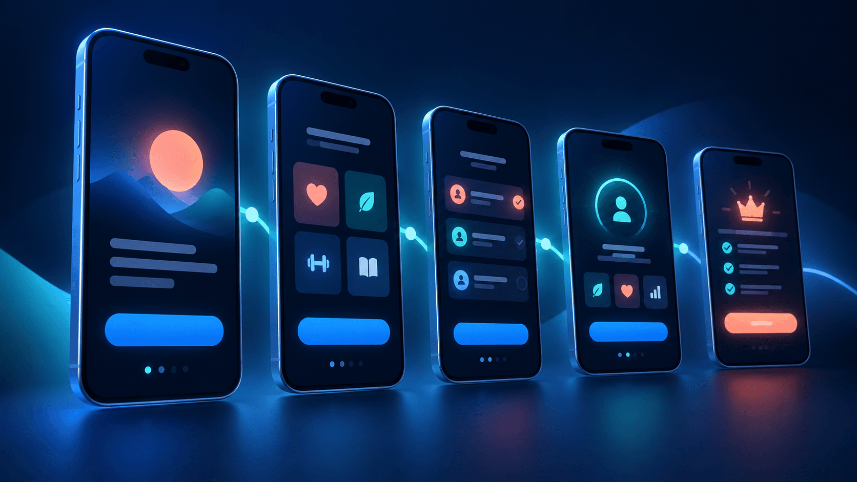
Many of the longer flows follow a recognizable sequence: welcome, goal, relevant questions, proof, a demonstration, a personalized result, and then a paywall. Ernesto Lopez and Adam Lyttle describe versions of this pattern. It works as a story because the user sees what their answers produced before seeing the price.
A result can be a useful plan, a first recommendation, or work the user has already created. “You’re all set” followed by an empty home screen is much weaker. Gotcha’s walkthrough includes a real identification task before payment; Finch lets people create a penguin during onboarding. In both cases, the user has begun using the app.
Personalization earns its place when it changes what the user gets.
4. Pick the length that matches the product
The posts do not agree on an ideal number of screens. Some subscription apps use 14 to 23 screens, with questions and a personalized plan before the offer. Nathan Geckler’s focus-app example takes the opposite route: a short introduction, a quick choice, then the app itself, with a paywall on a later visit.
The distinction is useful. If the plan is the product, a questionnaire may create the value. If the core action is immediately understandable, a long quiz can delay it. Screen count is a consequence of the experience you are building, not a target to copy.
5. Make the paywall a continuation of the result
In the long flows, the subscription offer usually appears after the personalized output. It can then explain what paying unlocks in terms the user already understands. Some examples add a discount after the first paywall is dismissed. Others ask for notification permission or a review during onboarding.
Those tactics deserve careful testing. A discount can change purchasing behavior; a review request can interrupt momentum; notifications can help only if they serve the goal the user chose. None substitutes for a convincing first experience.
6. Measure the whole staircase
A paid conversion rate alone cannot show where onboarding breaks. Instrument each meaningful step: start, goal selection, question completion, first useful action, result view, paywall view, trial start, and paid subscription. Then look at the drop between steps and by user goal or acquisition source.
Steven Cravotta and Frederick James both emphasize moving or removing questions to improve completion. Frederick reported raising onboarding completion from 70% to 85%, alongside an 8% install-to-paid rate. Lino reported roughly 12% download-to-paid for a goal-first hard-paywall flow. These are self-reported outcomes from different products, so they are context for experimentation rather than a universal standard.
A practical first version to test
Name the activation moment
Choose the first meaningful action a new user can complete.
Ask one outcome question
Use the answer to change the next recommendation or action.
Let the user do the core task
Make this a real interaction, not a slideshow of features.
Show what they made or learned
Give them a concrete result before presenting the offer.
Explain the subscription in context
Connect paid benefits to the goal and result they just saw.
Watch the step-by-step data
Remove friction where people leave, then test one change at a time.
This is a starting hypothesis, not a template every app should inherit. A reminder app may need notification permission early. A writing tool may be better off opening a document immediately. The best flow is the one that brings your users to the product’s value with the least unnecessary effort.
Sources we reviewed
These 13 X posts informed the article. Product outcomes and figures belong to their authors.
- Jay Dwivedi: seven onboarding tips
- Jay Dwivedi: client first screens
- Steven Cravotta: subscription flow
- Ernesto Lopez: onboarding structure
- Adam Lyttle: questionnaire sequence
- Lino: goal-first onboarding
- Lino: push winbacks
- Lino: competitor onboarding
- Endrew Cruz: Lightly walkthrough
- Jurre: Gotcha onboarding
- César Álvarez: Brainrot and Finch
- Nathan Geckler: short focus-app flow
- Frederick James: completion and paid conversion